What’s in a Poster?
Student elections are this Wednesday and Thursday at GW, and a very large pool of SA, MCGB, and PB candidates have come forward to promote themselves. According to The Hatchet, there are 56 student candidates this year, compared to 31 last year. This increase is evident to anyone passing through Academic Center, University Yard, or the Marvin Center. Posters adhere to the walls, and an unfortunate few lie on the ground, victims of the weather or a wayward hand.
Due to many restrictions on campaigning, name recognition is incredibly important. Most posters prominently display the candidate’s name, some include a picture, and a few include a slogan. After Obama’s “Change” campaign, it is difficult to deny the effectiveness of a strong slogan and graphic. Yet at GW, the slogans have been pretty tame. Allow me to feature a few of the posters I’ve seen, and evaluate their literary merits.
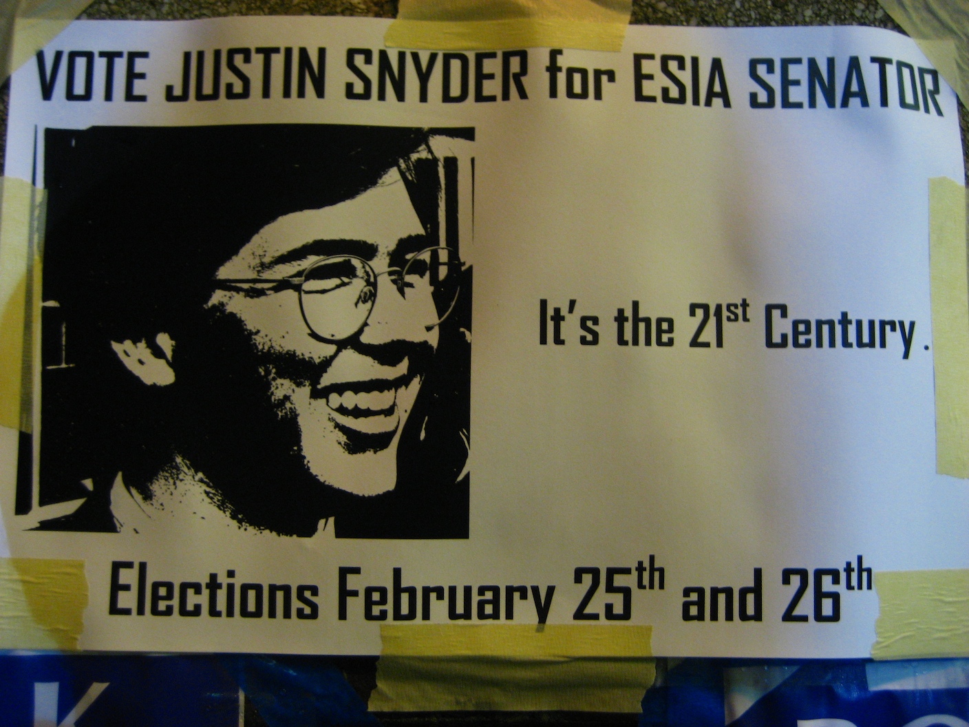
 “It’s the 21st century.” Justin Snyder takes a slightly unusual approach with his poster. He doesn’t make any promises or use a flashy picture. He uses a statement of fact. Facts are a powerful thing, especially when juxtaposed with such a dark and monochromatic picture. I assume Justin Snyder’s implied logic is something like this: 21st century = future = progress = Justin. The message is a little obscure, but the simplicity is to be admired.

Nick Polk has a flashy poster inspired by Catch Me If You Can. The poster is clean and efficient, but lacks Justin’s subtle originality and factuality. The arrows complement his slogan, “Moving forward together,” which accomplishes the task of implying that a vote for Nick is a vote for progress – a theme in this election. He also seems to be going for the “I Like Ike” constituency with his “pickpolk.com” web address, which I like better than is official slogan.
 Like Nick, Julie Bindelglass includes a personal picture on her poster. I’m sure all candidates would do this if the election ballot included pictures; unfortunately it does not. Unlike Nick, Julie has united her slogan – “Take Back the SA” – with her website address to reinforce her message. The poster is a little busy and difficult to read, but up close it is effective.

Some candidates, like Michael Komo, have posters very similar to those you would find during a real U.S. Senate race. Although the poster succeeds at prominently featuring his name, the red-white-blue combo is generic, and the lack of a catchy slogan means none of his personality shines through.
 Jason Lifton has a great poster, when you can find it. He uses the same palette as Komo, but in a less generic fashion, and his name is the most important thing on the poster. It helps that his website address also reinforces his name branding. Although he had the foresight to put up temporary posters, with promises of “real posters to come after rain,” some of these temporary ones have not been replaced. Jason doesn’t have much of a slogan, but like Justin he is also a fan of the facts.

I’ll let you be the judge of this last poster. One thing I did not realize about my slogan is that, since many candidates campaign using their surname, some of my target audience does not understand that Calder is my praenomen, and an unusual one at that. Perhaps I should have gone with my alternate slogan: “Community, Communication, Collaboration. Change you can cee.”


